One of the most annoying things to see, is text in a graphic that blends in, is hard to see, and is overall not very distinctive between the rest of the graphic. Here i'll show you a few tips that will help fix that problem.
First is a simple drop shadow. In GIMP, this is under filters, and in Photoshop, it's found in the Layer Effects panel. Here is a screenshot of TheZ3ro's site header before a drop shadow:
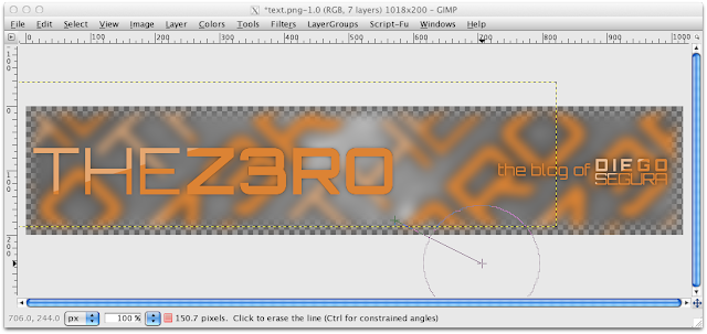 |
Text that reads "the blog of Diego Segura" does have a drop shadow.
The original drop shadow was sloppily erased for this demonstration. |
And here is after a drop shadow:
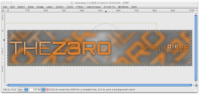 |
Color: black
Shadow radius: 15 |
This next tip should be common sense, but is still a problem with people. For more distinct text, switch colors! In a lot of my work for TheZ3ro with this orange color scheme, I keep it the same, but I use other ways to make it stand out. Here is TheZ3ro header with the text colors completely inverted:
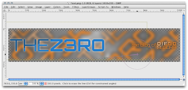 |
| The blue looks out of place with this color scheme, but is a good way to get distinct text. |
The next tip is already demonstrated in the past screenshots, and you've probably already noticed it: background blur. I used a gaussian blur, so that the text is the only thing in focus. Just make sure that you are only blurring a single layer, and notmultiple layers due to merging, mis-selection (Yep, mis-selection), or anything like that.
Hopefully this helped you find new techniques in Photoshop/GIMP, and makes your designs look better. Pass this on to any of your fellow designers that might find this post useful!


No comments:
Post a Comment